


Aaj ke samay mein data sirf numbers aur tables mein dekhna boring ho gaya hai. Agar aap chahte hain ki aapki presentation, report ya blog readers ke liye engaging ho, toh visualization tools ka istemal karna zaroori hai. Isliye Flourish Studio aata hai. Yeh ek no-code platform hai jahan aap bina coding seekhe interactive charts, maps, aur data stories bana sakte hain.
Flourish Kya Hai?
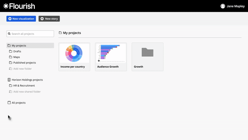
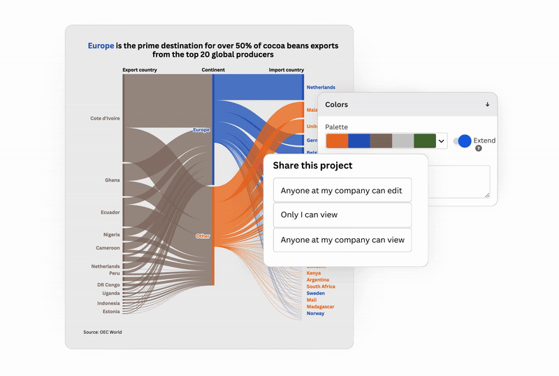
Flourish ek interactive data visualization tool hai jisme ready-made templates milte hain. Aap bas apna data upload karo, ek template choose karo, customize karo aur voila! – ek professional looking interactive chart ya map ready.
Aur best part? Aap isse directly website, blog ya presentation mein embed kar sakte ho.
Features of Flourish
Interactive Charts & Maps
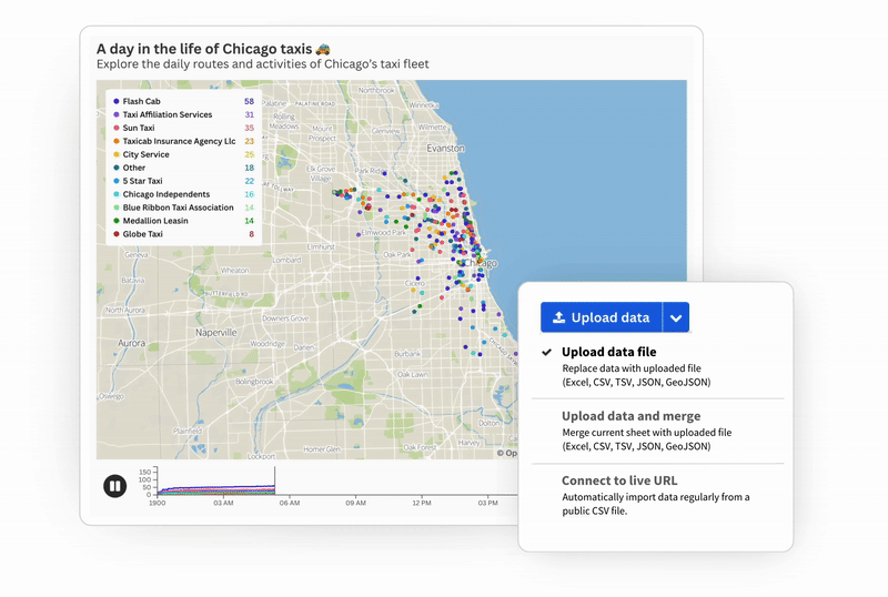
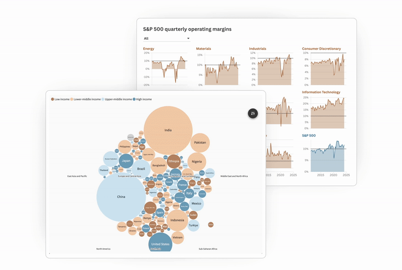
Line chart, bar chart, scatter plot, sankey diagram, aur geographical maps – sab kuch ready templates ke through banta hai.
Scrollytelling & Stories
Agar aap chahte ho ki reader scroll karte hi aapki visualization step-by-step update ho, toh “Flourish Stories” use kar sakte ho. Yeh ekdum engaging narrative create karta hai.
No-Code Platform
Coding knowledge zero ho toh bhi koi problem nahi. Sab kuch drag, drop aur settings ke through hota hai.
Custom Branding & Styling
Aap apne colors, fonts, aur brand style ke hisaab se charts ko customize kar sakte ho.
Easy Embedding & Sharing
Har project ke liye ek embed code milta hai, jo aap apne blog, website ya dashboard mein directly paste kar sakte ho.
Developer Support (SDK)
Agar aap developer ho, toh Flourish SDK ke through apne khud ke templates bhi bana sakte ho.
Work Mein Kaise Use Karein?
- Business Reports: Monthly sales data ko ek boring Excel sheet ki jagah Flourish ke interactive dashboard mein dikhaiye.
- Marketing & Campaigns: Customer survey ke results ko scrollytelling ke saath showcase karo.
- Education & Training: Teachers apne students ko complex concepts graphs aur charts ke saath easily samjha sakte hain.
Blogging / Journalism: Agar aap journalist ho ya blogger, toh Flourish ka use karke apni story ko engaging bana sakte ho. Example: election result maps, survey polls, ya kisi bhi data-driven kahani.
Pros & Cons
Pros
- Easy to use
- Templates ka huge collection
- Interactive storytelling options
- Canva integration (since Flourish Canva ka part hai)
Cons
- Free plan pe kuch limitations hote hain (branding/watermarking)
Bohot bade datasets ke liye performance issue aa sakta hai
Conclusion
Agar aapko apne data ko sirf readable nahi, memorable aur engaging banana hai, toh Flourish ek must-try tool hai. Chahe aap ek student ho, teacher ho, marketer ho ya journalist – yeh aapki presentations aur stories ko next level par le jaata hai.
Final Thoughts
Data ko sirf numbers aur tables tak limited rakhna ab purani baat ho gayi hai. Aaj ke readers aur audiences interactive aur engaging stories dekhna pasand karte hain. Flourish Studio ke saath aap apne boring spreadsheets ko ekdum nayi life de sakte ho – chahe wo ek marketing campaign ho, ek classroom lecture ho, ya ek blog story.
Sabse badi baat, iske liye aapko coding expert hone ki zaroorat nahi, bas thoda data aur thodi creativity chahiye. Ek baar try karke dekhiye, aap bhi kahoge:
“Excel boring tha, Flourish amazing hai!”
Ab aap batao:
Aap Flourish ko sabse pehle kis kaam ke liye use karna chahoge – business report, blog, ya apna next presentation?
Comments mein share karo, main bhi dekhna chahta hoon aapki creativity!


Leave a Reply